Netflix Feature Implementations
Category:
User Research, UX & UI
My Main Role:
User Research, UX & UI
Client:
Netflix x Softuni
Team:
1 Person
Duration:
4 weeks
As a part of my UX course at Softuni I had 4 assignments themed as 4 different Netflix cases. In order to test our skills and adaptability to already existing platform. This also allowed me to see how good I could adjust to an existing product.
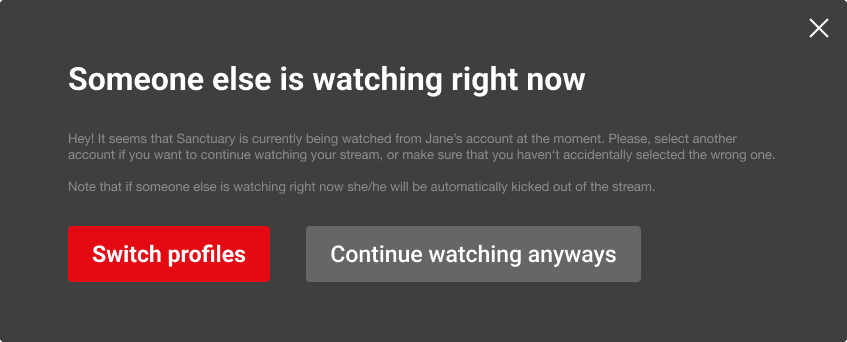
Users often find their watch progress disrupted because another person using the same profile has different viewing habits. This causes frustration, as users have to manually track their own progress or re-watch content to find their place.
(SOLUTION)
For the very first assignment I got some data from Netflix provided from Softuni. On that I decided to built different personas, to understand the data and wrap it up in different scenarios.
To have get closer to the root of their frustrations I decided to use the 5why's method. This quick approach allowed me to quickly dig into the most common concerns.
After that, I brainstormed on different ideas on how I could solve my personas' pain points while being also aligned with their needs.
Brainstorming for a while left me with 8 different approaches, which I evaluated using the Matrix of Value and Effort.
I solved the assignment by providing the highest impact and easiest solution which came up to me at that point.
Pop up Dialog to Solve the Problem
Netflix, in partnership with IMDb, aims to enhance the user experience by integrating more in-depth content information.
This initiative addresses two main areas:
(1) users frequently leave the platform to check IMDb ratings and reviews, disrupting their experience; and
(2) viewers often search for details about actors appearing in specific scenes, leading to unnecessary interruptions.
The goal is to present this information seamlessly within Netflix’s UI to keep users engaged and informed.
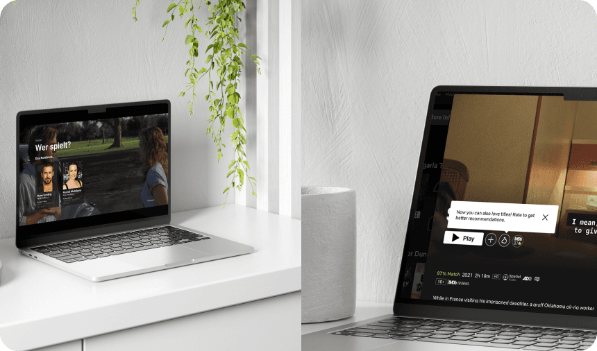
My task was to design solutions for both challenges. For IMDb ratings and reviews, I integrated them into content detail pages with a simple, accessible interface.
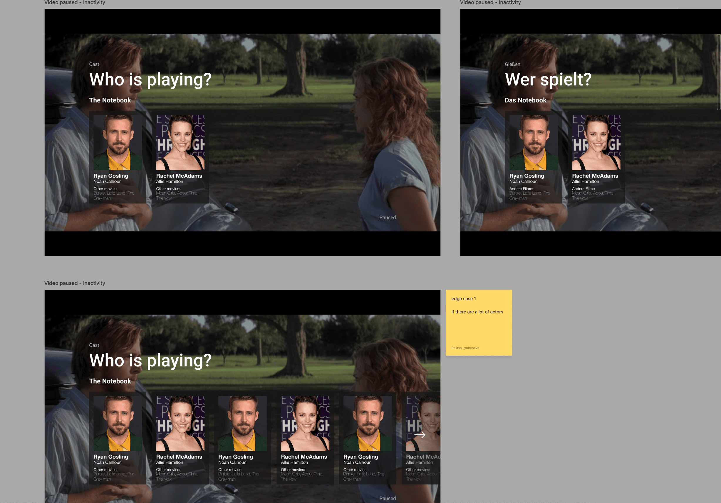
For actor details, I developed an overlay that appears when pausing, providing quick access to actor profiles.
Both designs aimed to enhance user experience by keeping information accessible without interrupting the viewing journey.
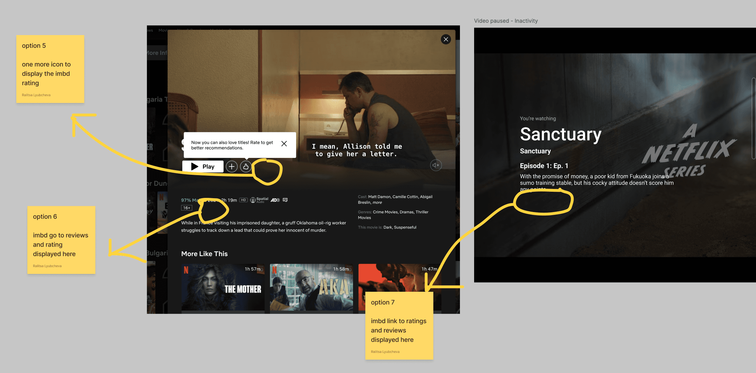
Brainstorming On Best Positioning of IMDb ratings & reviews
(SOLUTION FOR ASSIGNMENT N2)
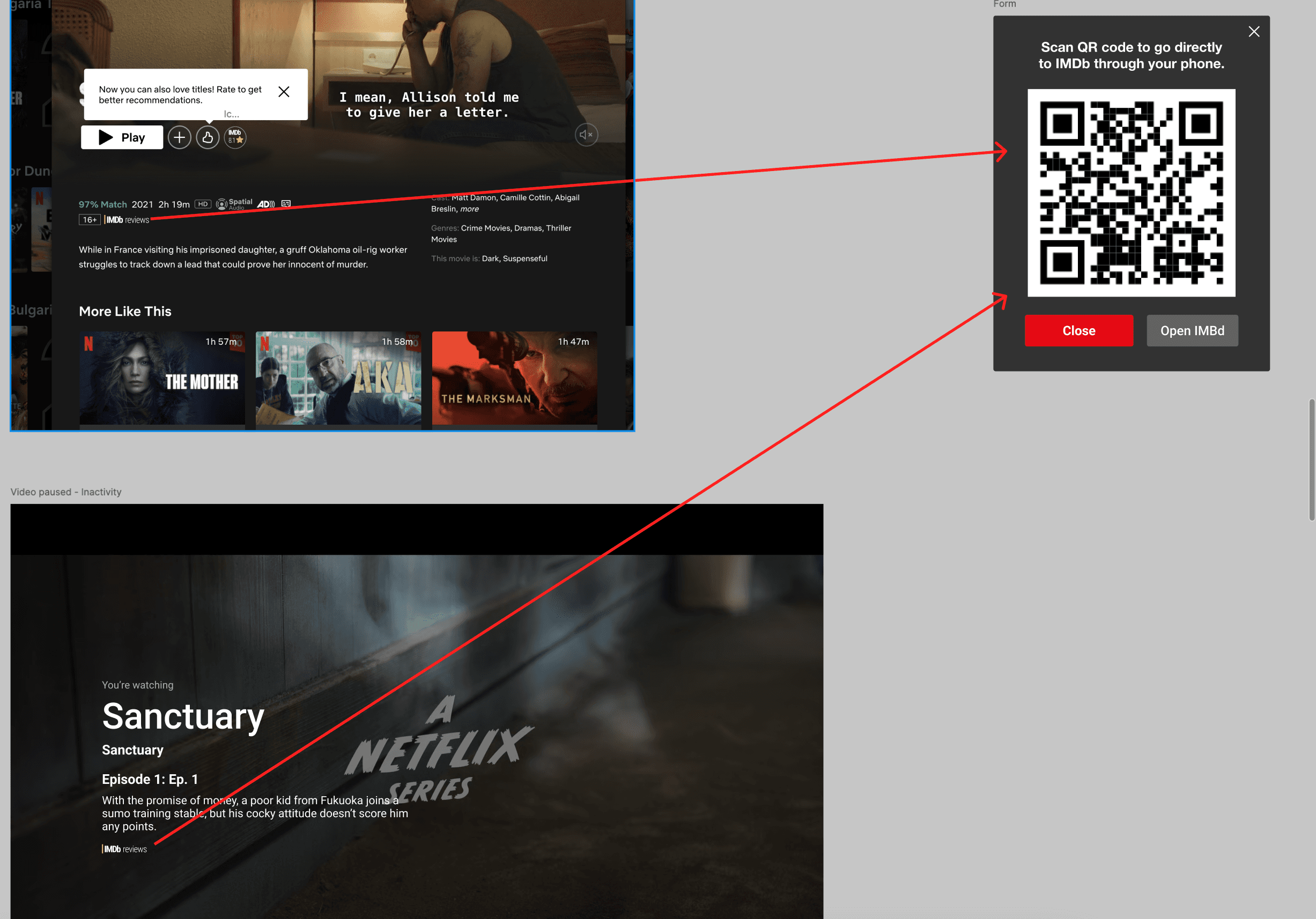
Through statistics and data I realised that it's safe to say that 'the phone is an extension to people's arm '. It is mostly likely than not that the phone is nearby if not even in usage while you users are dump scrolling in Netflix.
That is why I decided to solve the issue without taking the user out of Netflix, which may result in other distractions, therefore never finishing the intended to watch show.
By having a pop up with an QR Code I also provide solution both for users accessing Netflix through their TV's and laptops-
Solution For Integrating IMDb Ratings and Reviews
For the 2nd part of this assignment I decided to also I add edge cases such as more than just two cases.
German as language which often breaks design because of its length of words. (Which in this case was not as beneficial, because of the fewer contents.
Actor Details Feature
In order to be confident in my decision making I again used data of which I then brainstormed different options with pros and cons, and put them in a High Value Low Effort Matrix, to distinguish the one would best serve me and the users.
Netflix Podcast, Final Assignment and the one in Complex Domain
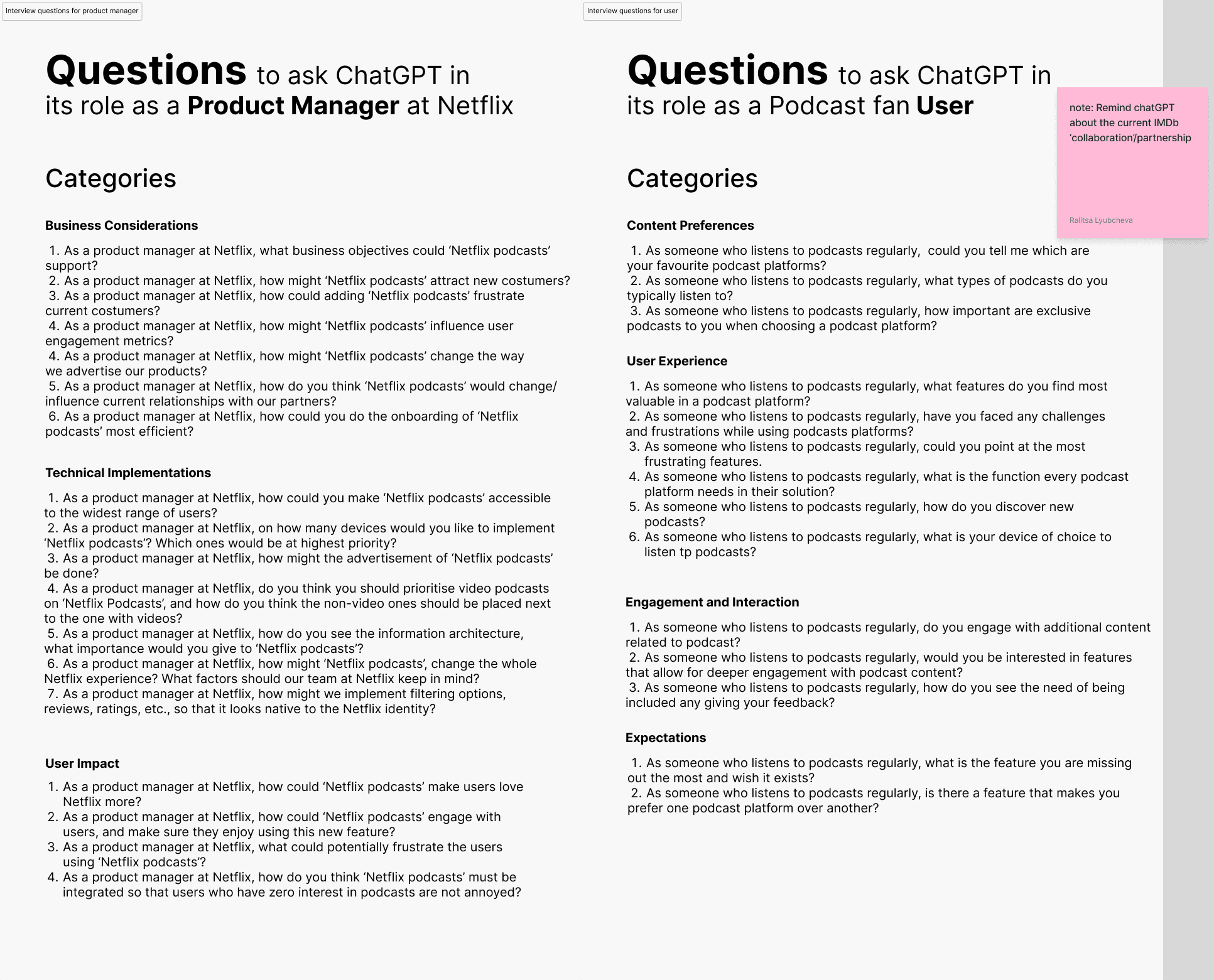
Interview Questions for The Product Manager At Netflix
Interview Questions for a Podcast Fan User
In order to imitate real world, we had to ask ChatGPT to act as the Product Manager at Netflix for the interviews we needed to collect.
This approach while not acceptable (real human should be the centre of any type of user testing) for a real work environment gave us a lot of answers and data to go through and analyse.
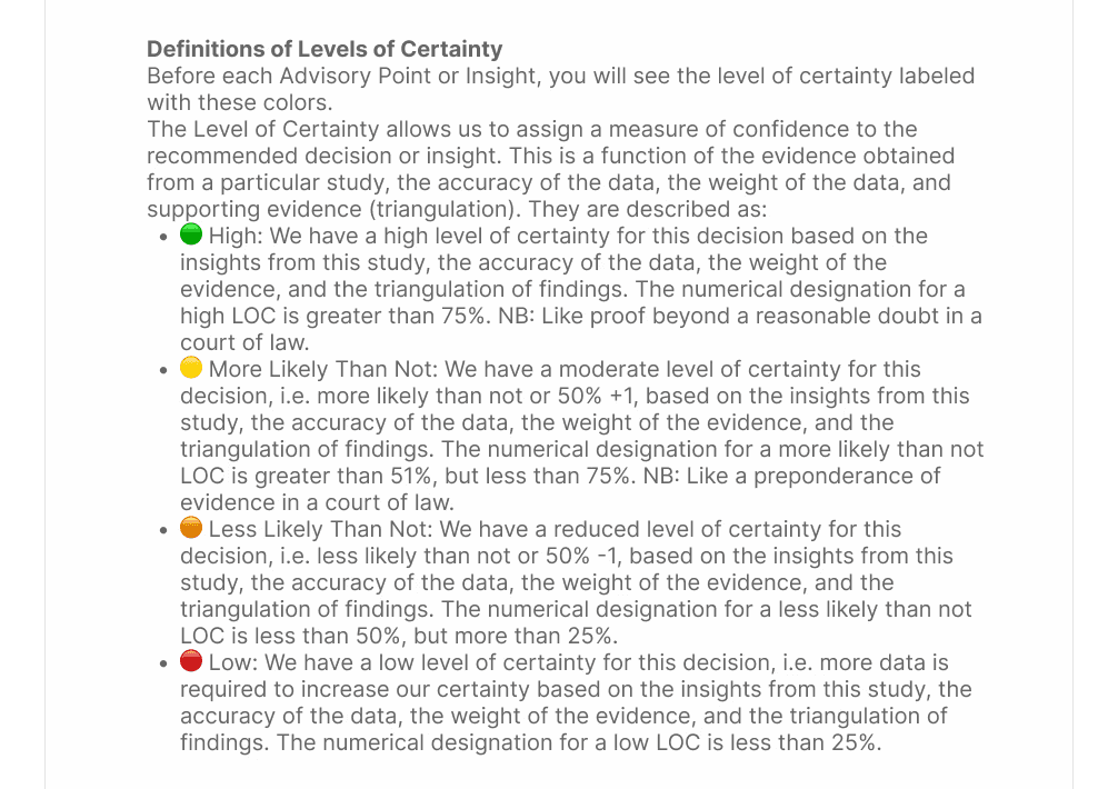
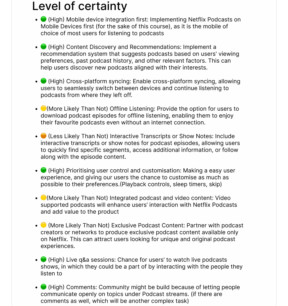
I got the key insights and takeaways which I decided to further evaluate with some more data collection. Then I created a level of certainty list from the interview answers-
Level Of Certainty Definition
User Research, UX & UI
List of Options with Level of Certainty
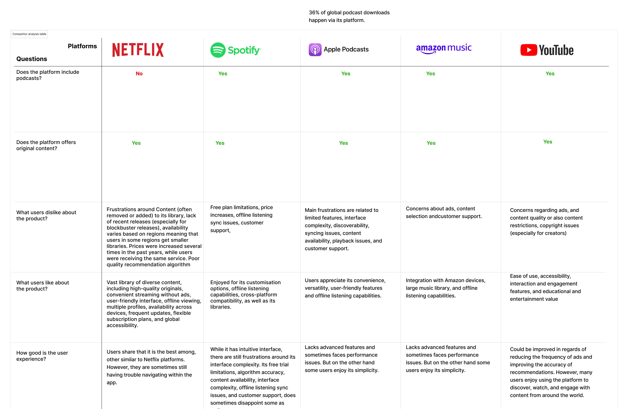
I created a list of Direct and Indirect Competitors after which I decided to do an investigation of 2 of Netflix's direct competitors.
Spotify being one of them and Apple podcasts being the second.
Part of Competitor Analysis Table
The Competitor Analysis Table helped me recognise where Netflix is positioned among it's competitors.
It showed me its strength and weaknesses, which was beneficial to help me see areas in which Netflix could improve.
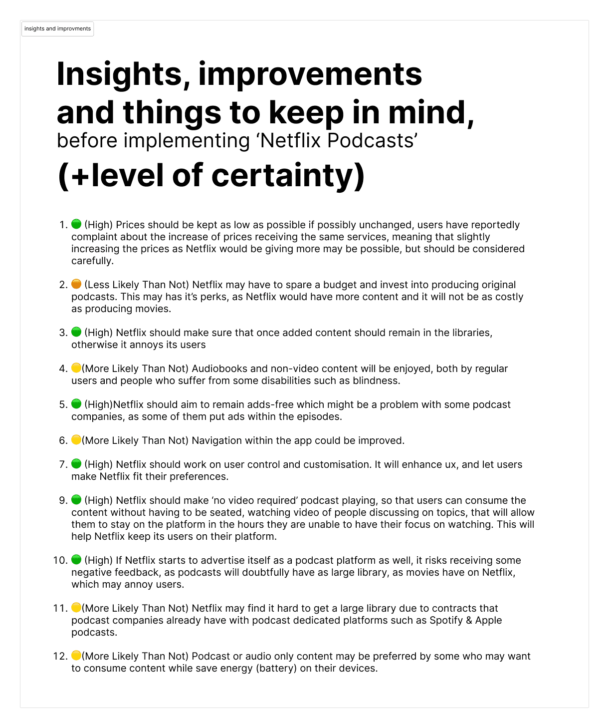
After having the table it was easier for me to summarise everything into a list of insights, improvements and things to keep in mind + level of certainty.
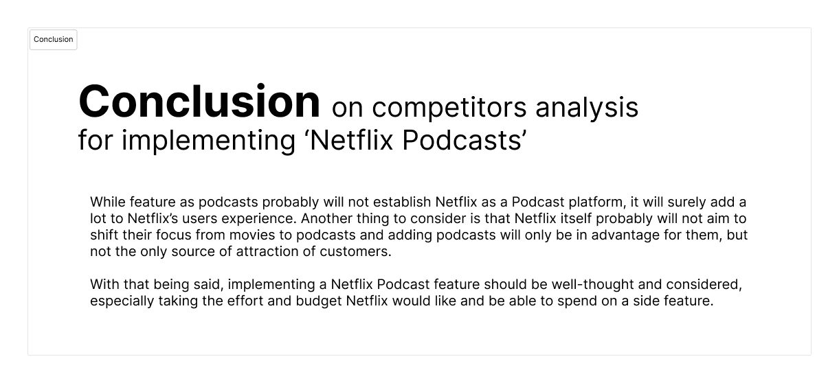
I did a conclusion after to compile all my insights.
After having That I did defined the problem, brainstormed on features and ideas, did groupings and categorisations, prioritised using plugin which worked as high value low effort matrix.
Because of personal prioritizations and another deadlines at my full time education going on I could not hand in a finished design solution.
However, I decided to move on doing only taxonomy, sitemap and a user map of what I would have designed if I had time.
Please Click on Open Figma File to my access the Full Exam
