Tøjkrogen - The Vintage Store
Category:
Translating Research into Strategy
My Main Role:
Client:
Tøjkrogen
Team:
5 people
Duration:
6 Weeks
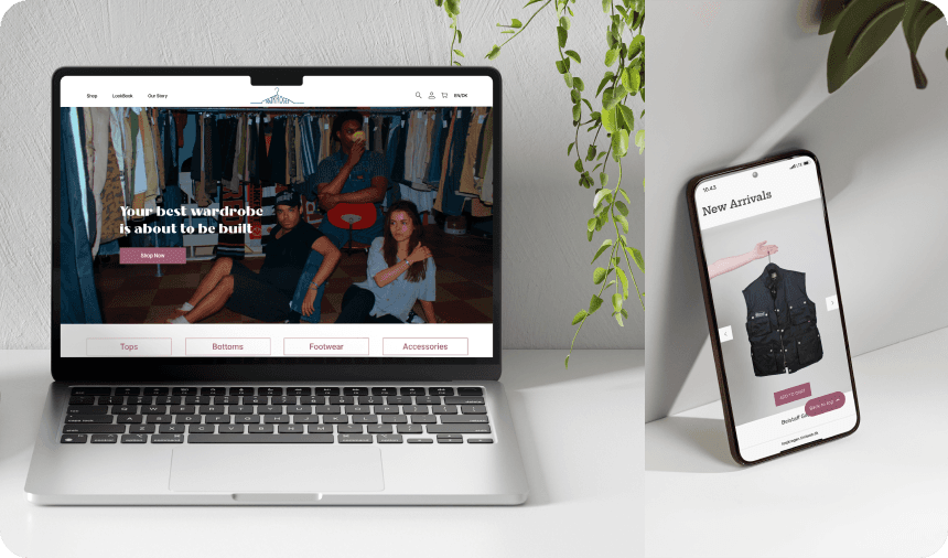
TøjKrogen, a vintage clothing store in Aarhus, wanted to expand its reach by creating an online store that mirrored the in-store experience. We had to maintain the cozy environment the store gives, while also addressing customer concerns about online second-hand shopping.
The store was limited by foot traffic and lacked an online presence, making it difficult to attract new customers.
Shoppers also had reservations about buying second-hand clothing online, such as concerns over sizing and quality.
We quickly realised we needed to build a platform to overcome these barriers, reflect the store’s brand, and create trust.
(SOLUTION)
By employing a range of UX research and design methods, we created a digital solution that extended TøjKrogen’s reach, enhanced the customer experience, and built trust in their curated vintage collection.
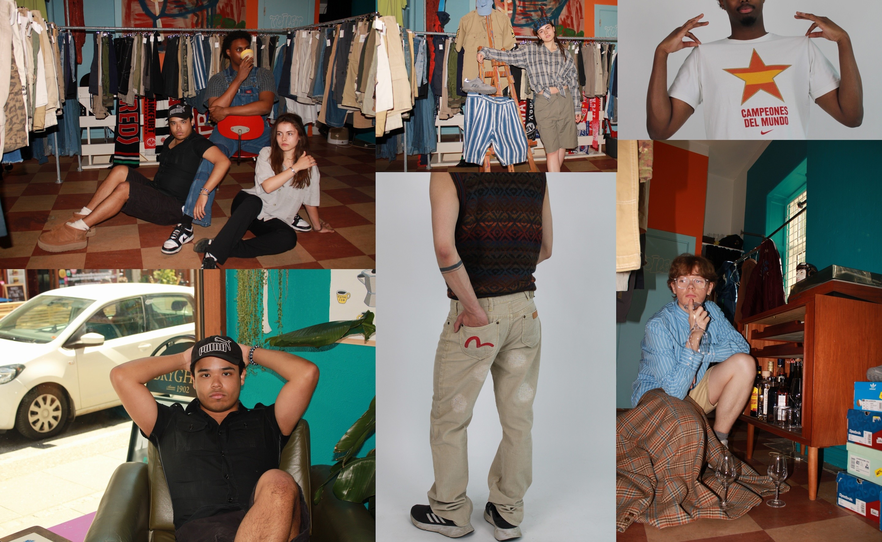
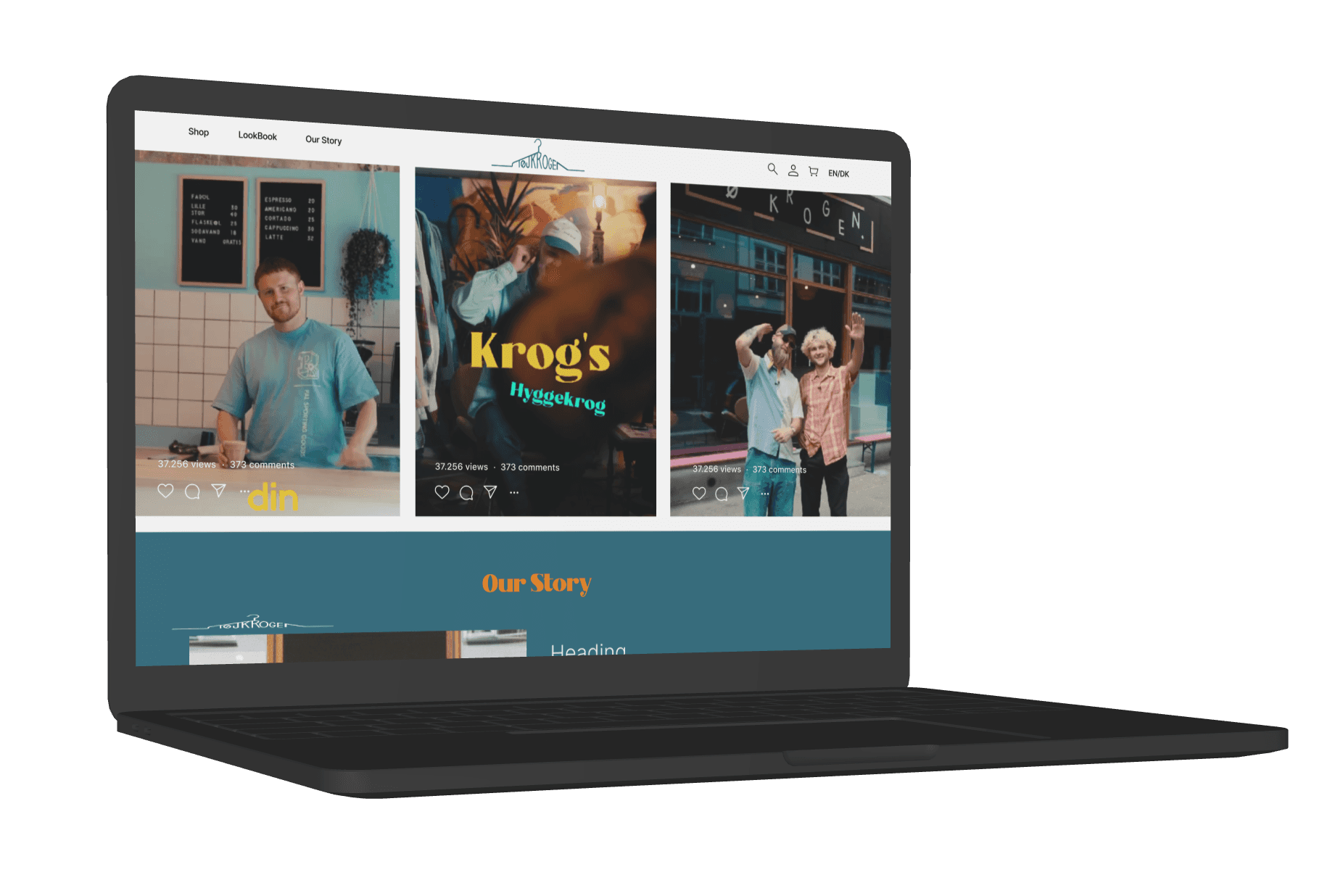
Photoshoot my group and I did aligned with the goals and vibe Tøjkrogen's
As mainly being lead by UI/UX design knowledge and background, I led key areas of this project, including user research, wireframe creation, and content strategy, collaborating closely with my team throughout the design and development phases.
DESIGN PROCESS
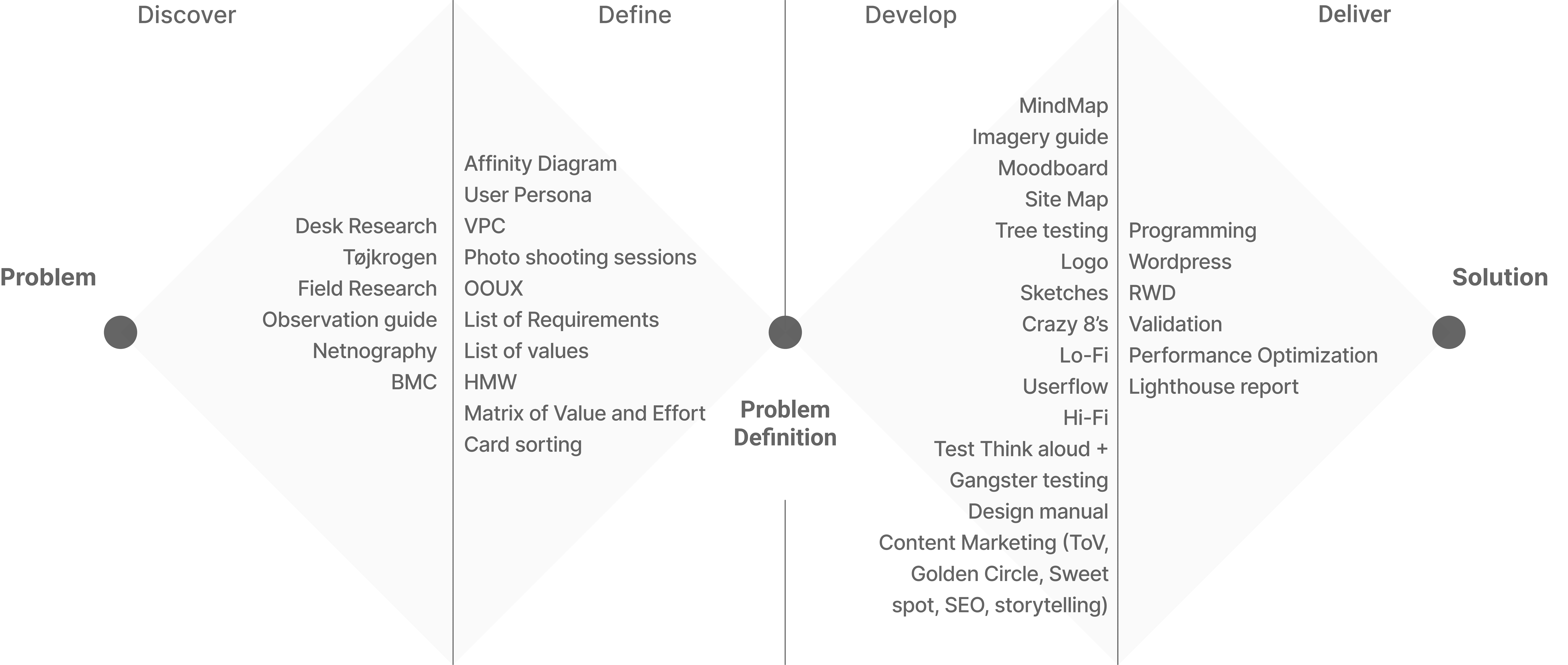
The Double Diamond provided us with a structured approach to problem-solving in UI/UX design, emphasizing user-centered research and iterative development. This framework helped us ensure clarity, collaboration, and creativity throughout the design process.
(DISCOVERY)
Gaining Insight into the Market and Users
We used a mix of desk research, field research, and interviews to understand the vintage clothing market and TøjKrogen’s customer base.
We identified key competitors in Aarhus and examined their online presence. This gave us a clearer picture of what successful vintage stores were doing digitally, helping us determine how TøjKrogen could differentiate itself.
Conversations with the store owners and employees revealed the importance of high-quality, handpicked items. This shaped our decision to focus heavily on detailed product photography to communicate quality online.
Leading the Netnography research on social media, I uncovered key pain points and trends around second-hand shopping. This revealed user concerns like inconsistent sizing and product quality, which we addressed in our design through high-resolution photos and detailed descriptions.
Translating Research into Strategy
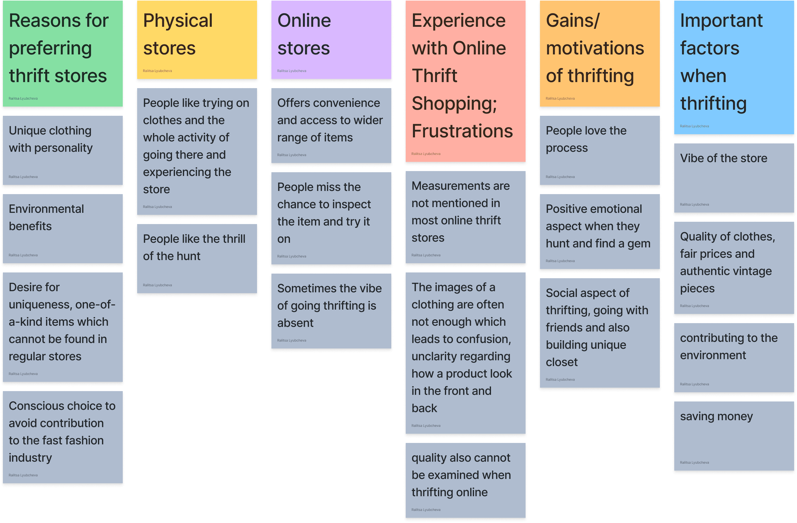
Affinity Diagram
Once we had gathered research, we organised and interpreted the data using Affinity Diagram and created a persona to represent the typical customer.
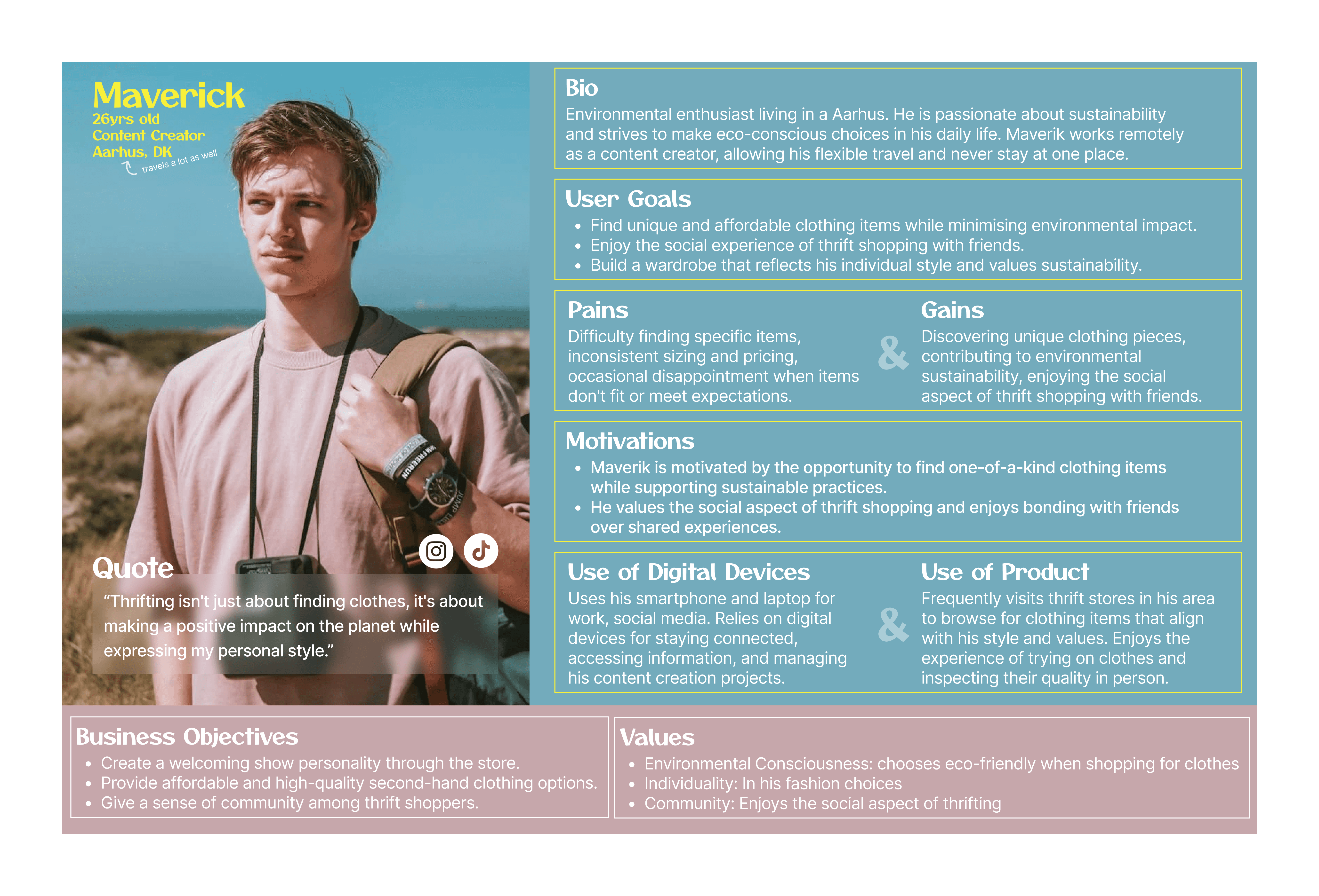
User Persona
"Maverick," our primary persona, represented an eco-conscious individual who values both style and sustainability. This allowed us to make design decisions that catered directly to these values, like emphasising authenticity and quality in product pages.
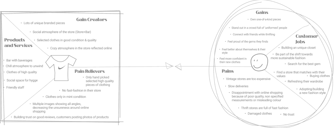
Value Proposition Canvas
Crafting the User Experience
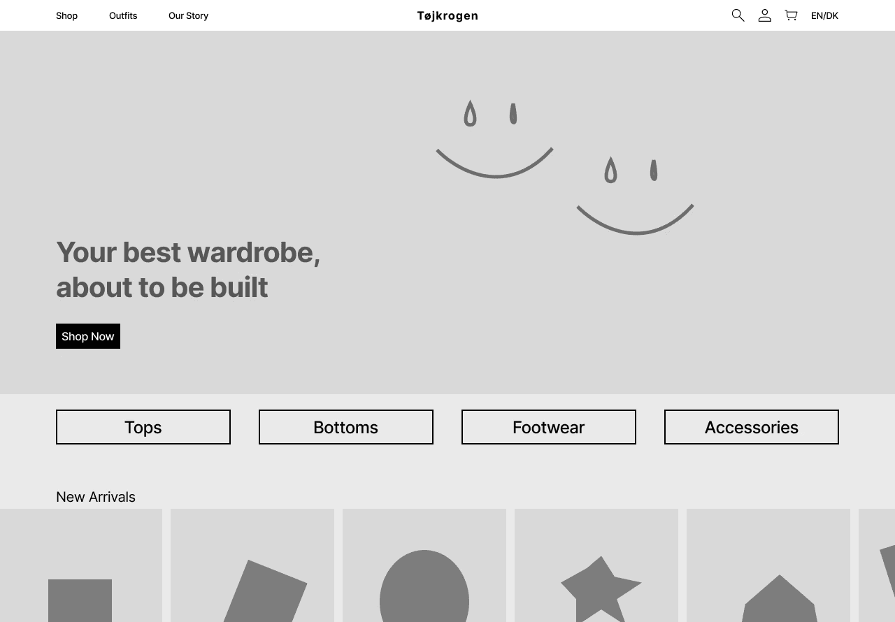
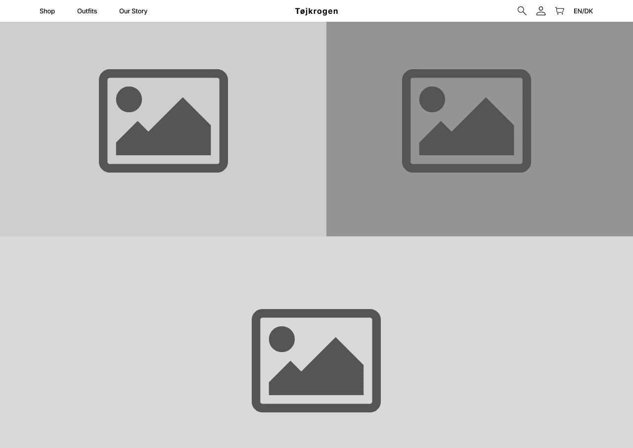
We began with Lo-Fi wireframes to sketch the layout of the website, focusing on user-friendly navigation and ease of access to products. Testing these wireframes with users revealed areas of confusion in the navigation, leading us to simplify the layout in later stages.
Home Page
Translating Research into Strategy
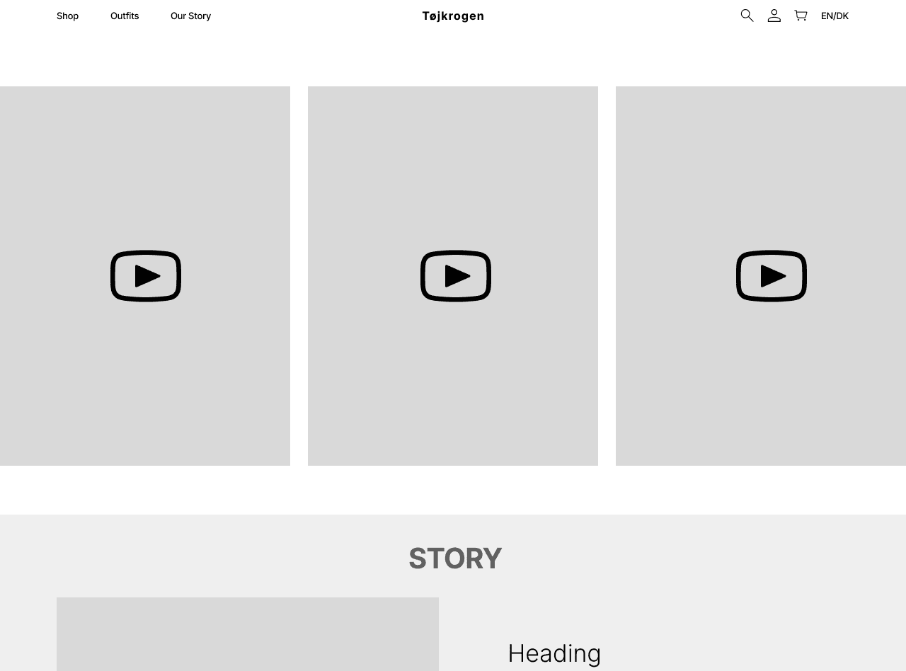
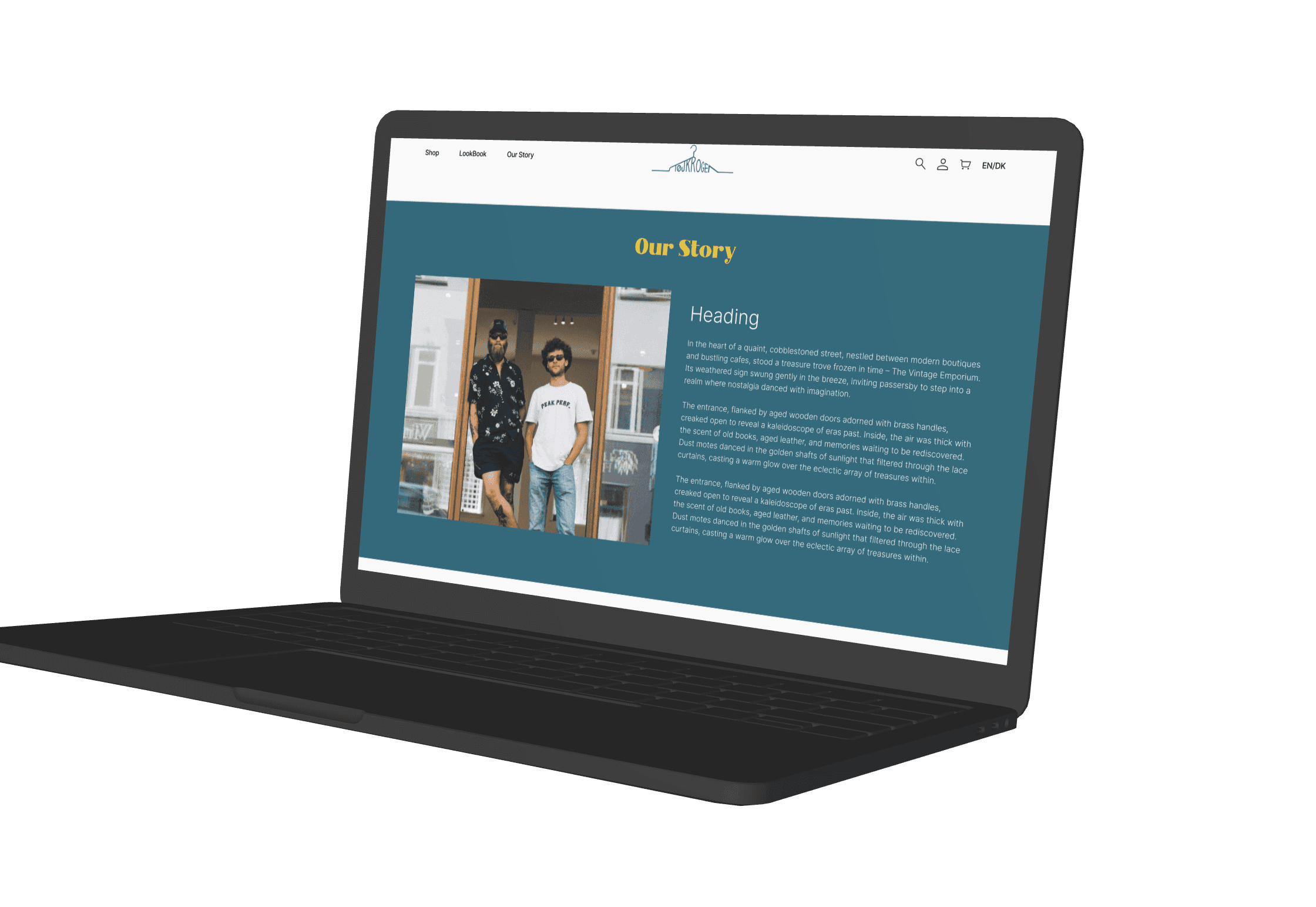
Our Story Page
Lookbook Page
Mapping out the user journey helped us design an intuitive experience that aligned with user expectations. We made it easy for visitors to move from browsing to purchasing with minimal friction, leading to improved usability and fewer clicks to checkout.
Final Implementation and Testing
With the design refined, we built the website in WordPress and enhanced it using tools like WooCommerce for e-commerce functionality.
Detailed product photography was critical for building trust. By conducting two photoshoots, we were able to provide images that showed the fabric texture, colours, and quality of the vintage clothing. This resulted in more informed purchasing decisions and fewer returns.
We performed contrast checks and A/B testing to ensure the website was readable and user-friendly for all visitors, including those with visual impairments. This improved overall accessibility and compliance with WCAG 2.0 standards.
Usability testing with real users refined the design, ensuring it was intuitive and engaging.
Old Hi-fi of 'Our Story' page
New Hi-fi of 'Our Story' Page with Rearranged Sections and Additional Improvements
