WasteLess - Coop's Mystery Bags Initiative
Category:
User Research, UX & UI
My Main Role:
User Interaction Lead
Client:
Quick Info x Coop
Team:
4 people
Duration:
4 weeks
This project aimed to design a B2C digital solution for Quick Info, a social media marketing company, to reduce food waste by encouraging consumers to purchase products nearing expiration. By collaborating with Coop stores, we developed a strategy that connects businesses with their audiences while addressing the environmental and economic impact of food waste in the retail sector.
Food waste is a significant challenge in Denmark, where the country has the highest food waste per capita in the EU.
Quick Info, a social media marketing company, partnered with Coop to tackle this issue. The central question was:
How can we help Coop reduce food waste while boosting in-store traffic and consumer engagement without requiring a separate app?
(SOLUTION)
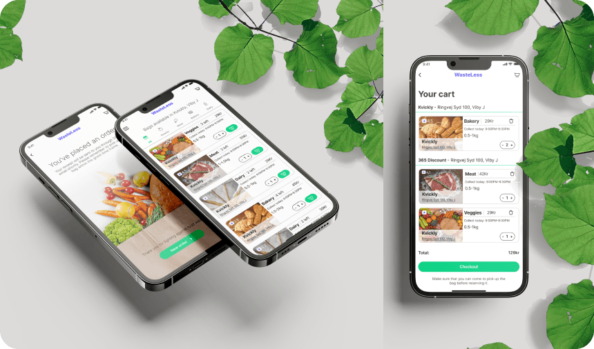
It emerged as a user-friendly web app that allows customers to purchase Mystery Bags—bundles of discounted food items nearing their expiration dates.
This initiative not only addresses food waste but also makes shopping more exciting and affordable for consumers.
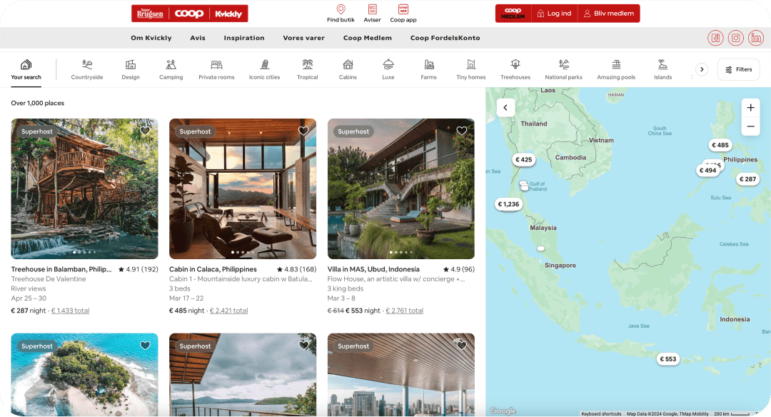
Airbnb’s website + Coop‘s website header
My role in this team project assigned by my lecturer was ‘User Interaction Design Lead’. While this was the one thing I was solely responsible to tackle there were various aspects in which both me and my teammates were collaborating along our journey of providing Quick Info with solution for the hot topic of food waste.
DESIGN PROCESS
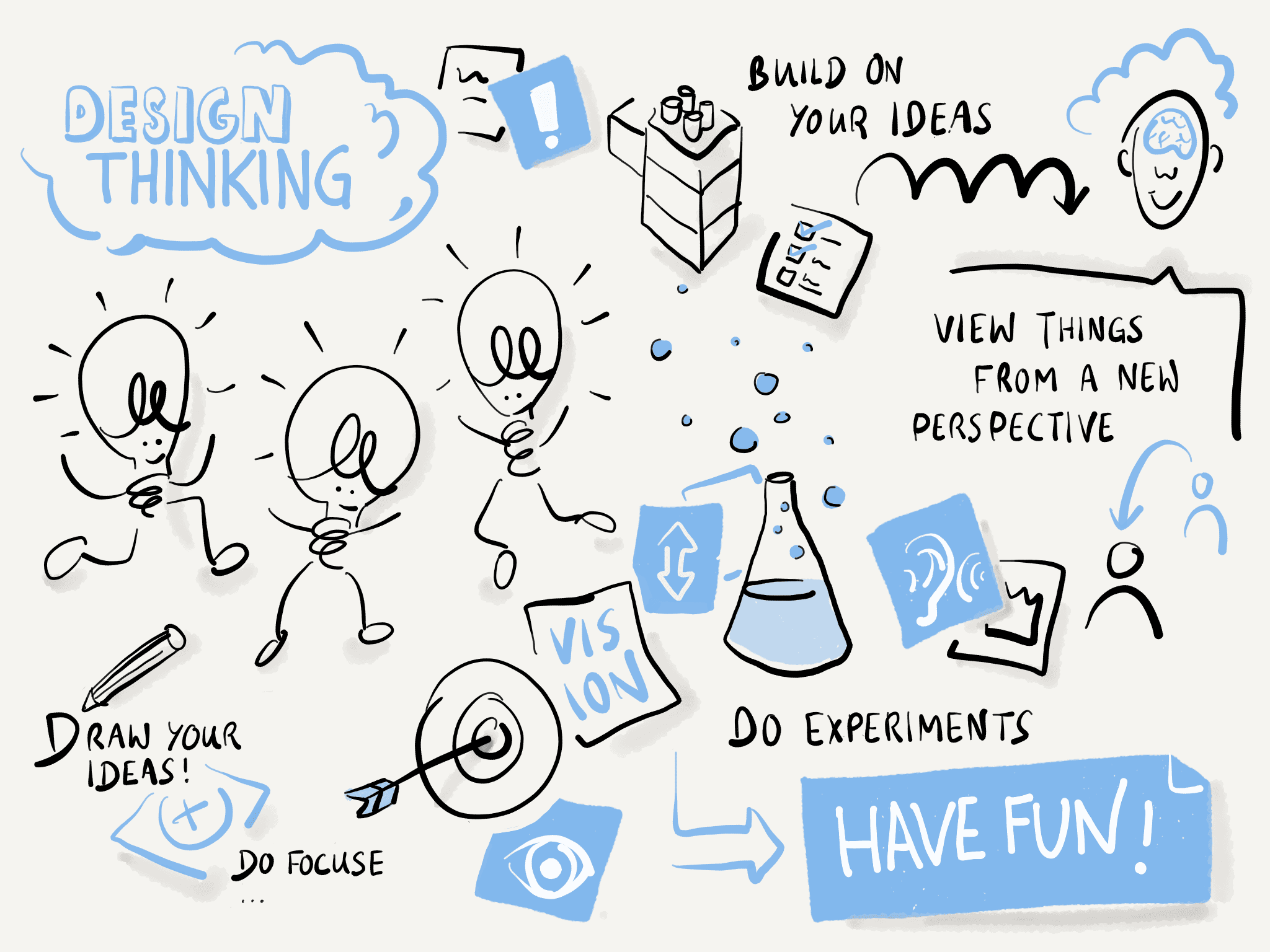
We adopted the Design Thinking as an approach and mindset, the Coop's Mystery Bags initiative focused on user-centric design to effectively address food waste.
This methodology involved defining user needs through research, creating personas, brainstorming solutions, prototyping, and testing.
By following a user focused process, the team developed an engaging platform that not only promotes sustainability but also enhances the consumer experience, making it easier for customers to purchase discounted food items nearing expiration.
IBAcademy's illustration of Design Thinking
The team established a clear problem statement based on user insights.
Extensive user research was conducted, leading to the creation of a user persona, Louise Jensen, a 43-year-old nurse who values convenience and sustainability.
Airbnb’s website + Coop‘s website header
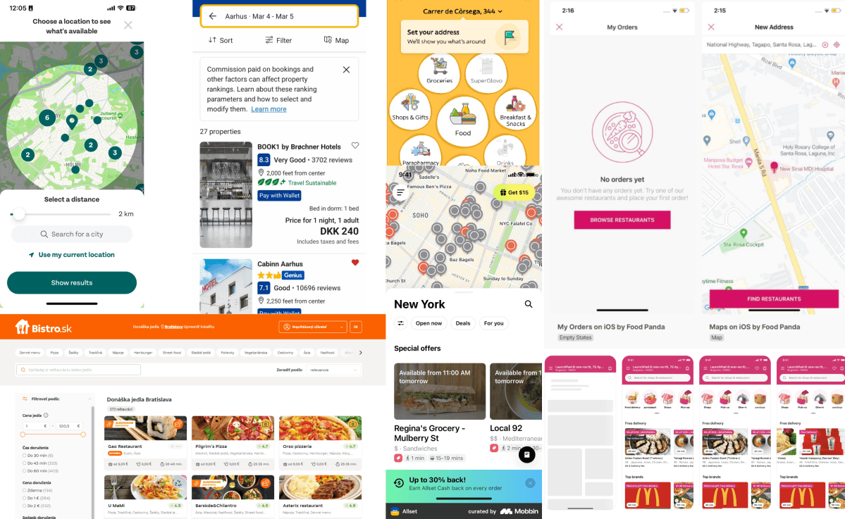
Serving users’ needs meant following conventions. That’s why we knew we had to follow the conventions of already proven to be successful websites, and just integrate to our solution so we could fit within the standards.
Adaptability is the key.
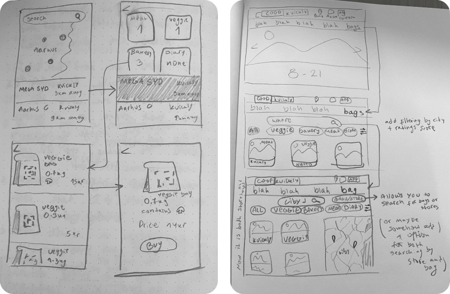
First Mobile Version Sketches
First Desktop Sketches (we did not develop a hi-fi on these because of future prioritisations and considerations based on hour research)
Brainstorming sessions generated creative solutions, resulting in sketches and wireframes to visualise the user journey.
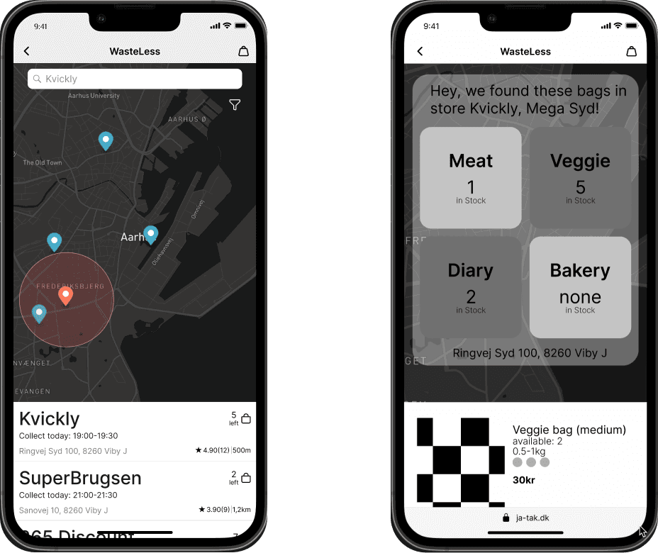
Find Store Page
Select a Bag Page
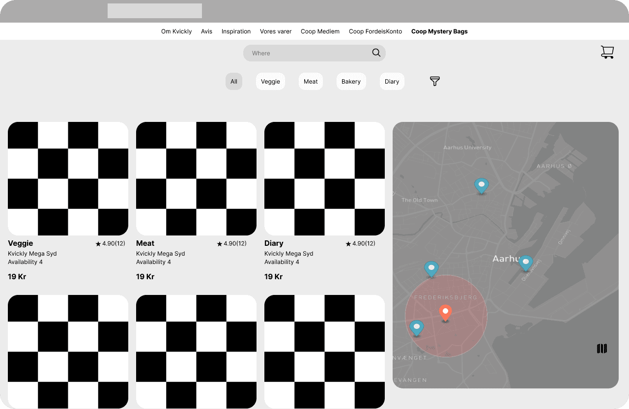
Low-fidelity prototypes were developed and tested, leading to a high-fidelity prototype that incorporated user feedback.
Find a Bag Lo-Fi Desktop
User Research, UX & UI
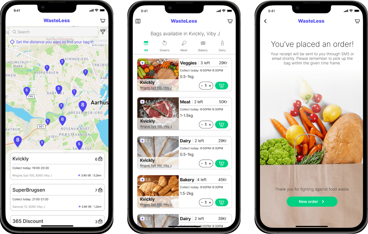
Find a Store, Buy a Bag and Successfully Placed order
Usability testing with real users refined the design, ensuring it was intuitive and engaging.
The Final Web App design and experience benefited greatly
from a few things me and my teammates knew we had to
pay attention to.
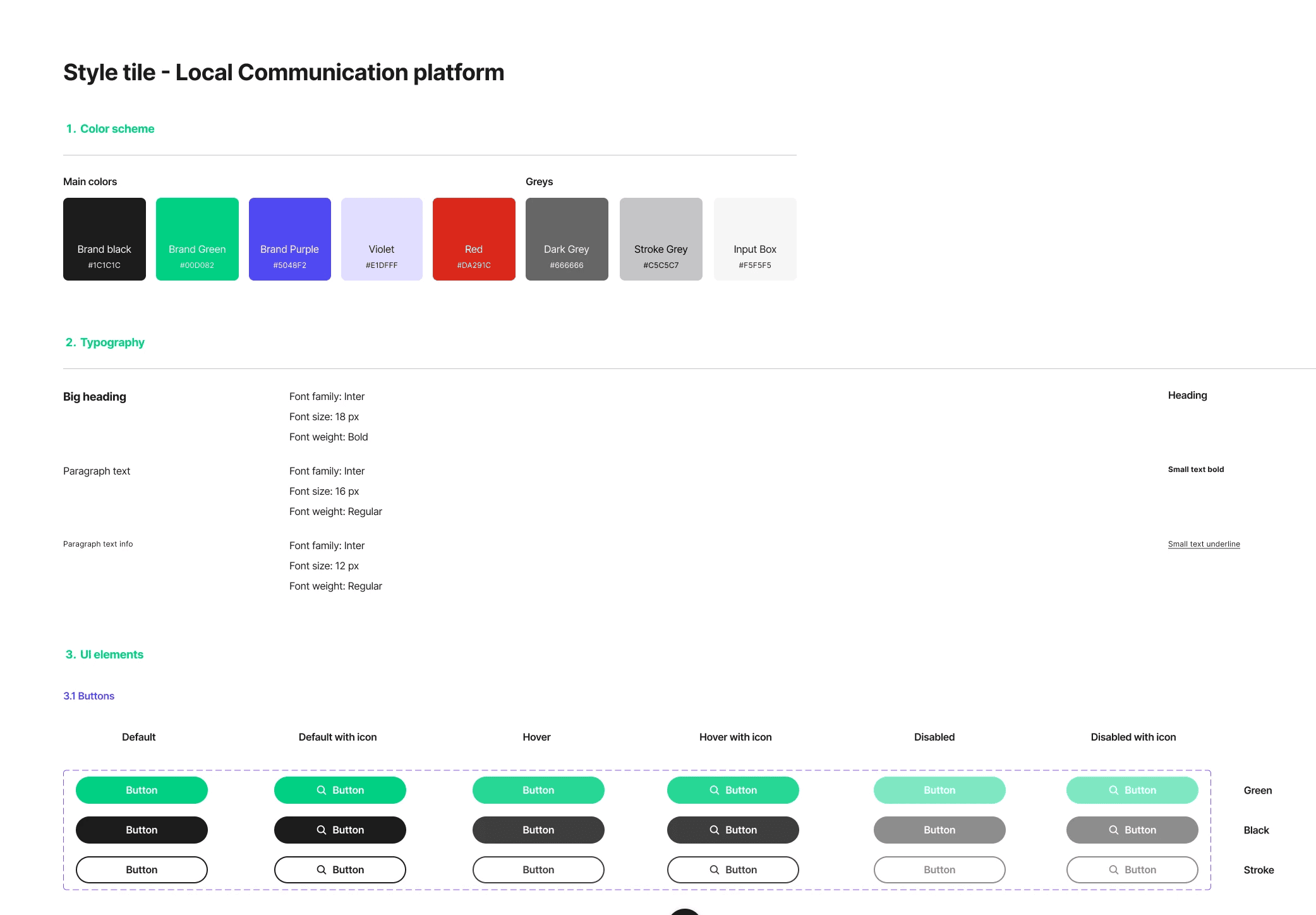
A cohesive design guide ensured the app aligned with both Coop's and Quick Info’s branding while being visually appealing.
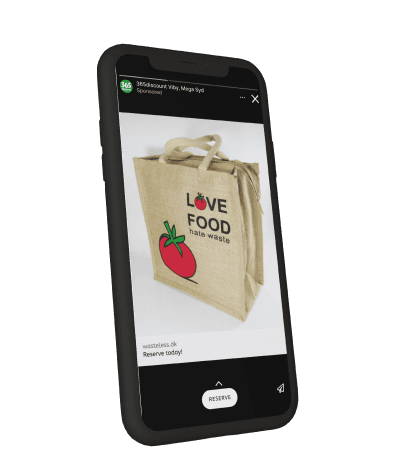
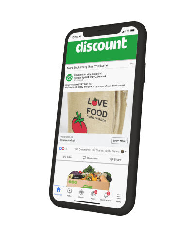
Different backgrounds may require different approaches. That is why knowing that Coop will promote their new web app both on facebook and on instagram made my team think of ways to give customers the shortest way to all customers to their mystery bags.
(Instagram Flow)
Coop has only one instagram account on here.
Therefore, we thought that it will be the smartest to send customers to our map page first so that they can put the nearest to them store.
(Facebook Flow)
Coop has it’s page for every local store here.
That is why we thought that it will be best to skip the map page here, because people that are already following their local store page are likely to be close to their store of choice.
They will start their user journey directly from browsing a mystery bag.
